Digital

Digital Newsletter Redesign
I was tasked with redesigning the company’s internal newsletter, alongside being in charge of the design of the company’s monthly newsletter, with the aim of improving its overall look, usability, and engagement.
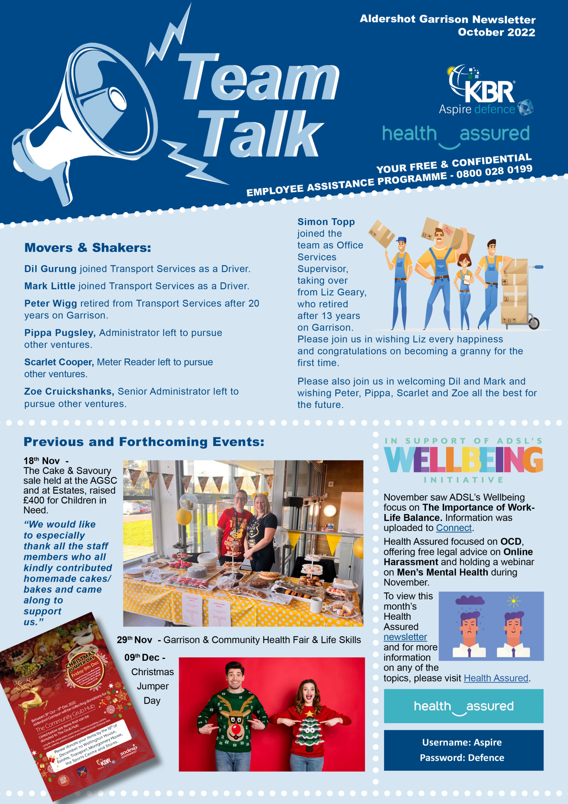
The original newsletter relied heavily on a single blue colour palette, with dotted lines used to separate content. While functional, the design lacked visual hierarchy and felt dated.
As part of my approach, I identified an opportunity to modernise the Team Talk logo, even though this was not part of the original brief. I retained the core concept of the megaphone but refined it using clean, contemporary iconography and stronger typography to create a more current and engaging visual identity.
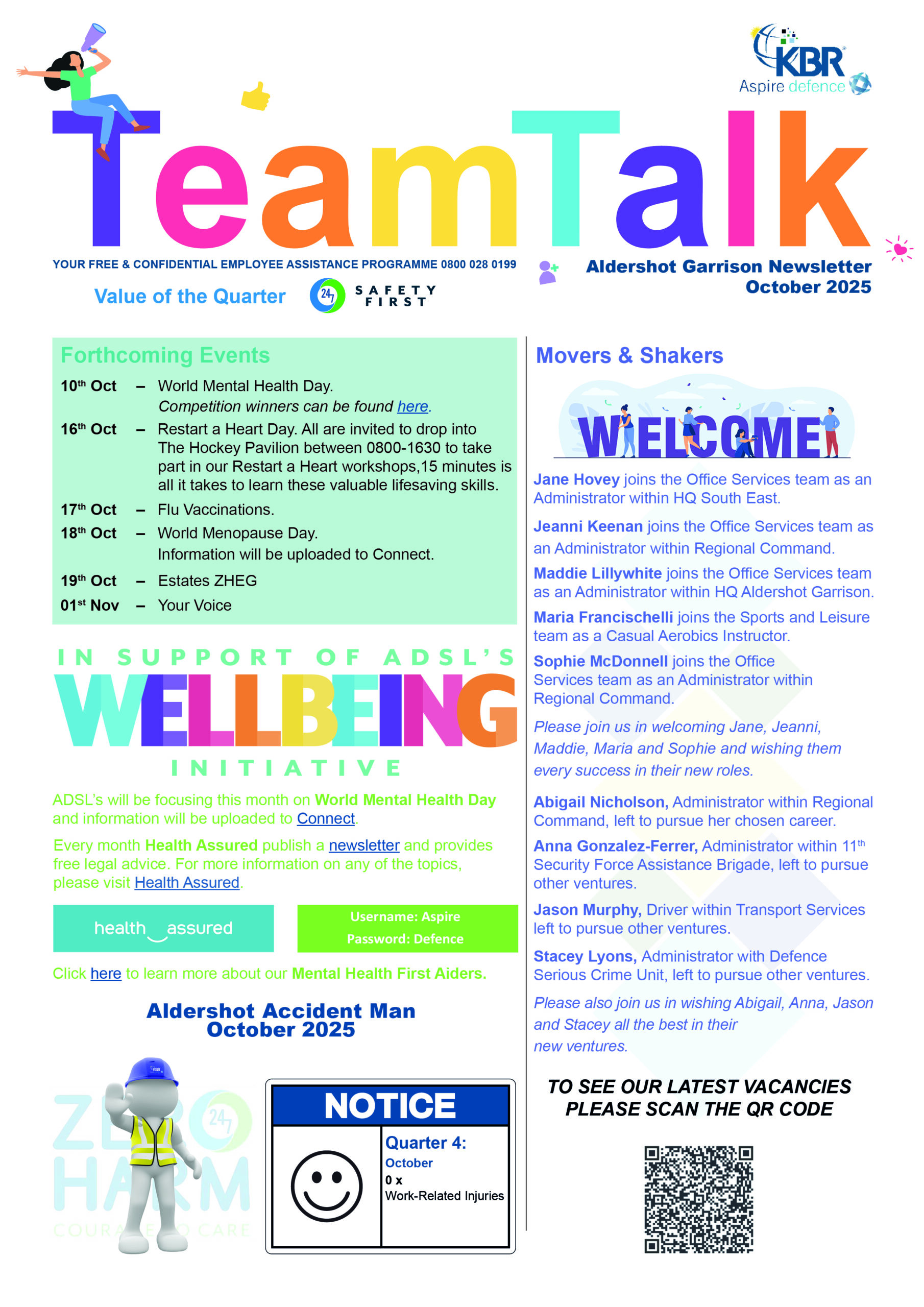
A key focus of the redesign was the introduction of a vibrant and flexible colour system. Moving away from the single-tone layout, I used bold colours to define sections, improve navigation, and create a more dynamic reading experience. I also evolved the use of line elements – drawing from the original dotted motif to create clearer structure while maintaining a sense of continuity.
The updated layout significantly improves clarity and readability, with stronger hierarchy, better spacing, and more intuitive content flow. The result is a more engaging and visually modern newsletter that enhances internal communication while staying aligned with the company’s identity.
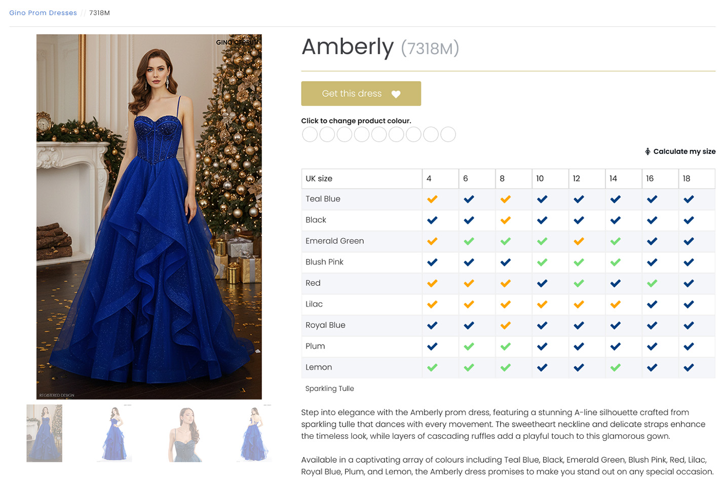
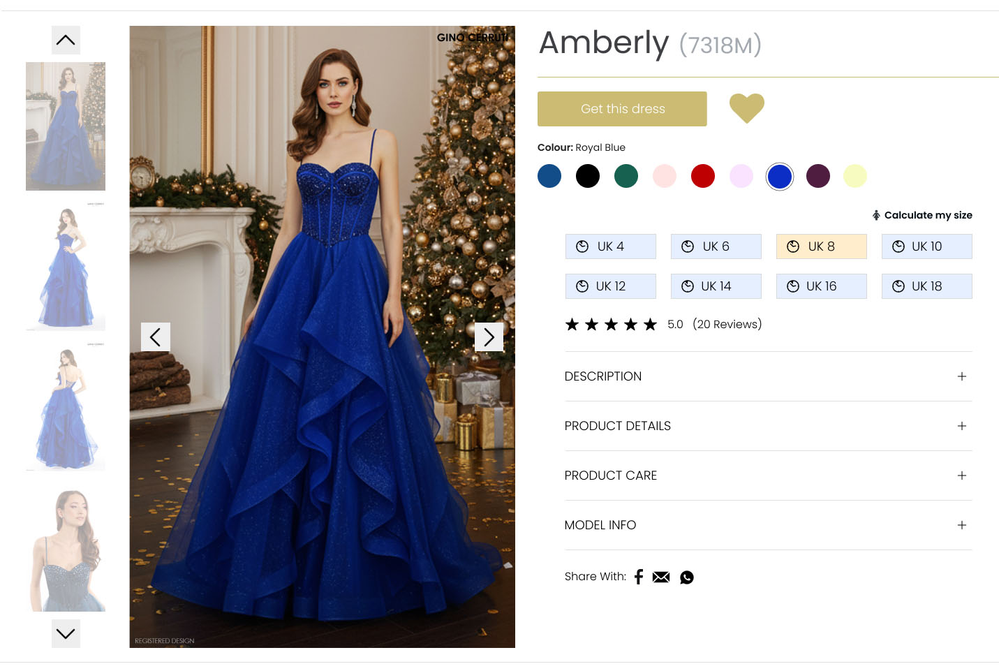
Product Page Redesign
As part of a pre-interview assessment, I was tasked with redesigning a product page to improve usability, clarity, and overall user experience.
My approach focused on refining both visual hierarchy and functionality. I reorganised the model imagery by dress colour to create a more consistent and intuitive browsing experience. To further support this, I introduced a clear visual indicator for colour selection by adding a subtle black outline around the active option – addressing the lack of feedback in the original design.
I also reviewed the functionality of key interactive elements. The “love heart” icon was originally placed within the “Get This Dress” button, which could be misleading as the icon is commonly associated with saving or favouriting items. I repositioned it alongside the button to better reflect user expectations, and proposed the addition of a dedicated Favourites page to allow users to easily access and compare saved items.
To simplify the interface, I removed the availability chart and instead integrated relevant information directly within each colour option. As I did not have access to brand guidelines, I retained and adapted colours from the existing design system to ensure visual consistency.
Recognising the importance of social proof in e-commerce, I introduced review star ratings linked to customer feedback, helping users make more informed purchasing decisions. I also proposed the inclusion of a dedicated product information section to clearly present key details, improving overall usability.
Additional enhancements included enabling product sharing to increase engagement and convenience.
Overall, my redesign focused on creating a clearer, more intuitive, and user-centred experience while aligning with familiar e-commerce patterns.
Social Media Video Content
A collection of short-form, creative video content produced for social media platforms. This work explores dynamic editing, visual storytelling, and engaging pacing to capture attention in fast-moving digital spaces. I enjoy combining the rhythm of music with visual design to create edits that feel cohesive, energetic, and engaging. It reflects experience in crafting visually compelling content designed to perform effectively across a range of online formats and audiences.