Logos

Lekáreň Dorothea
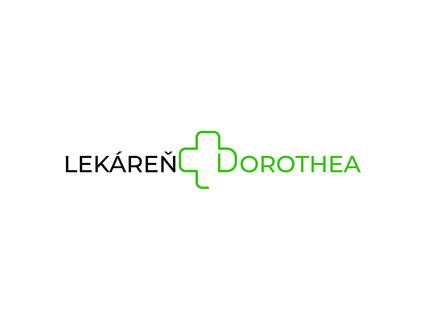
The Lekáreň Dorothea logo is designed to clearly communicate healthcare, trust, and accessibility through a clean and contemporary visual language. The central element – a cross, universally recognized as a symbol of pharmacy and wellbeing, is seamlessly integrated with the letter “D” of Dorothea, creating a cohesive and distinctive mark.
This connection between symbol and typography reinforces the brand identity, making the logo both functional and memorable. The cross not only represents care and health, but also acts as a visual bridge between the two words, unifying the composition.
Color plays a key role in structuring the identity. The name is divided into two parts using contrasting colors, improving readability while subtly referencing the primary colors of the Plus pharmacy network, with which the pharmacy is affiliated. This choice strengthens brand recognition and aligns the logo within its professional context.
Overall, the design balances clarity and symbolism, resulting in a modern and approachable identity that reflects professionalism, care, and reliability.
Hotel Crane
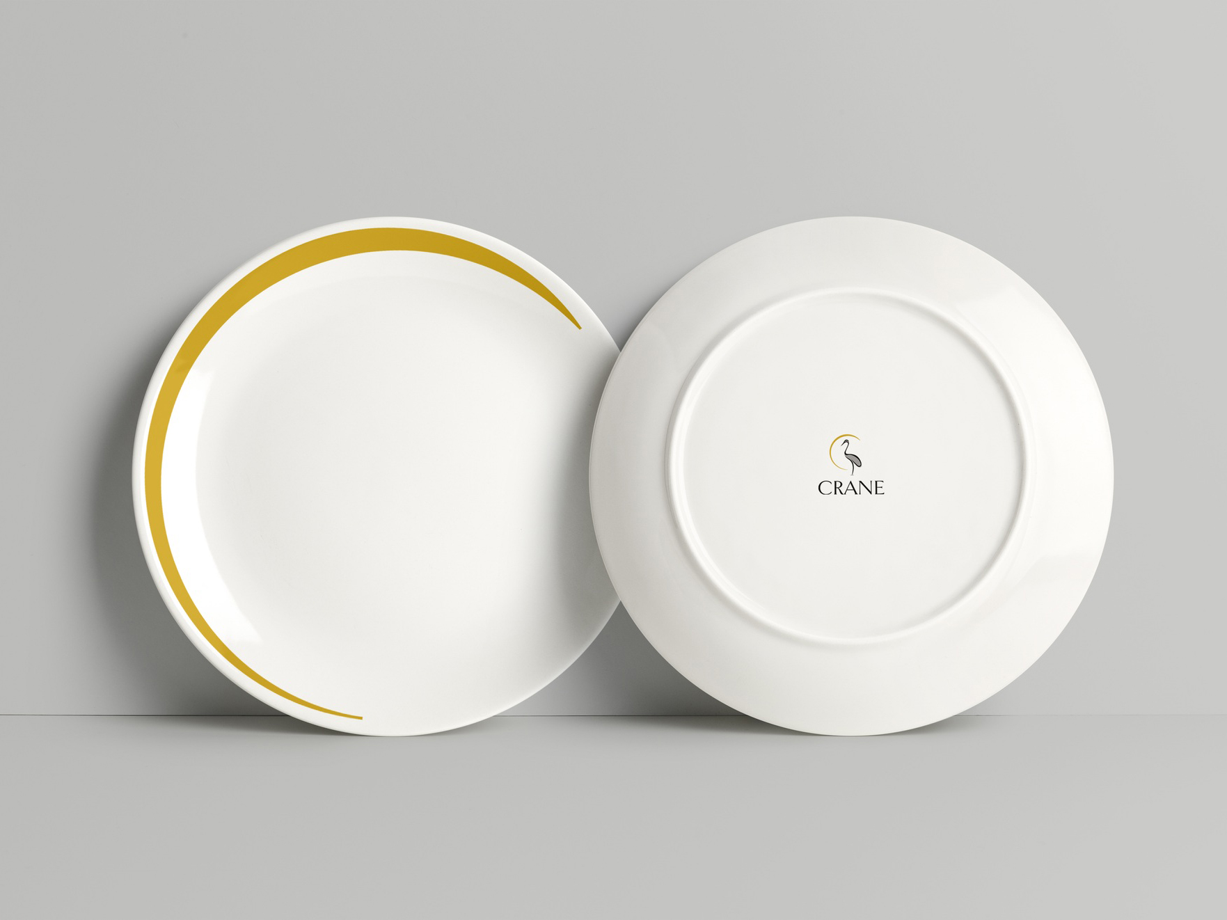
The logo for Hotel Crane, Fuerteventura is built around symbolism and clarity to reflect the brand’s values. The crane, inspired by Asian culture, represents longevity, happiness, and care – key concepts aligned with a hotel designed for senior guests and people with disabilities. Its calm, static posture conveys relaxation and security.
The semi-circle element evokes the sun, referencing the warm climate of Fuerteventura and reinforcing ideas of comfort, tranquility, and wellbeing. The color palette combines gold, symbolizing warmth and quality, with black and silver tones to communicate elegance and professionalism.
The typography complements the symbol through refined serif details, enhancing readability while reinforcing a sense of sophistication and trust. Altogether, the logo delivers a balanced visual identity that communicates care, relaxation, and premium service.
Simi
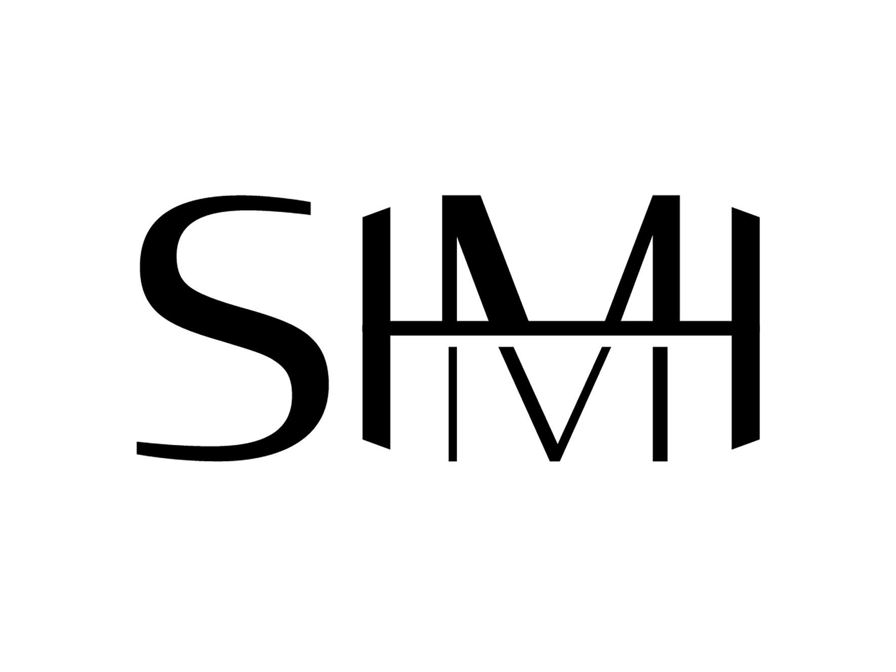
The SIMI logo, created for a fitness clothing brand, is designed to visually embody strength, balance, and transformation through minimal yet meaningful forms. The two “I” characters are connected by a horizontal bar, forming the shape of a weight—an immediate reference to fitness and strength training.
This bar intersects the letter “M,” dividing it into two parts and enhancing the visual prominence of the weight. The composition also subtly suggests hands gripping the bar, reinforcing the idea of control, effort, and active performance.
The contrast within the “M,” with a heavier upper section and a slimmer lower structure, reflects physical progression and muscle development achieved through training. The overall geometric construction and bold lines communicate stability, discipline, and resilience—core values of the fitness brand.
The result is a clean and impactful identity that merges typography with symbolism, directly connecting the brand name to the world of fitness and activewear.
Second Hand Vinyl
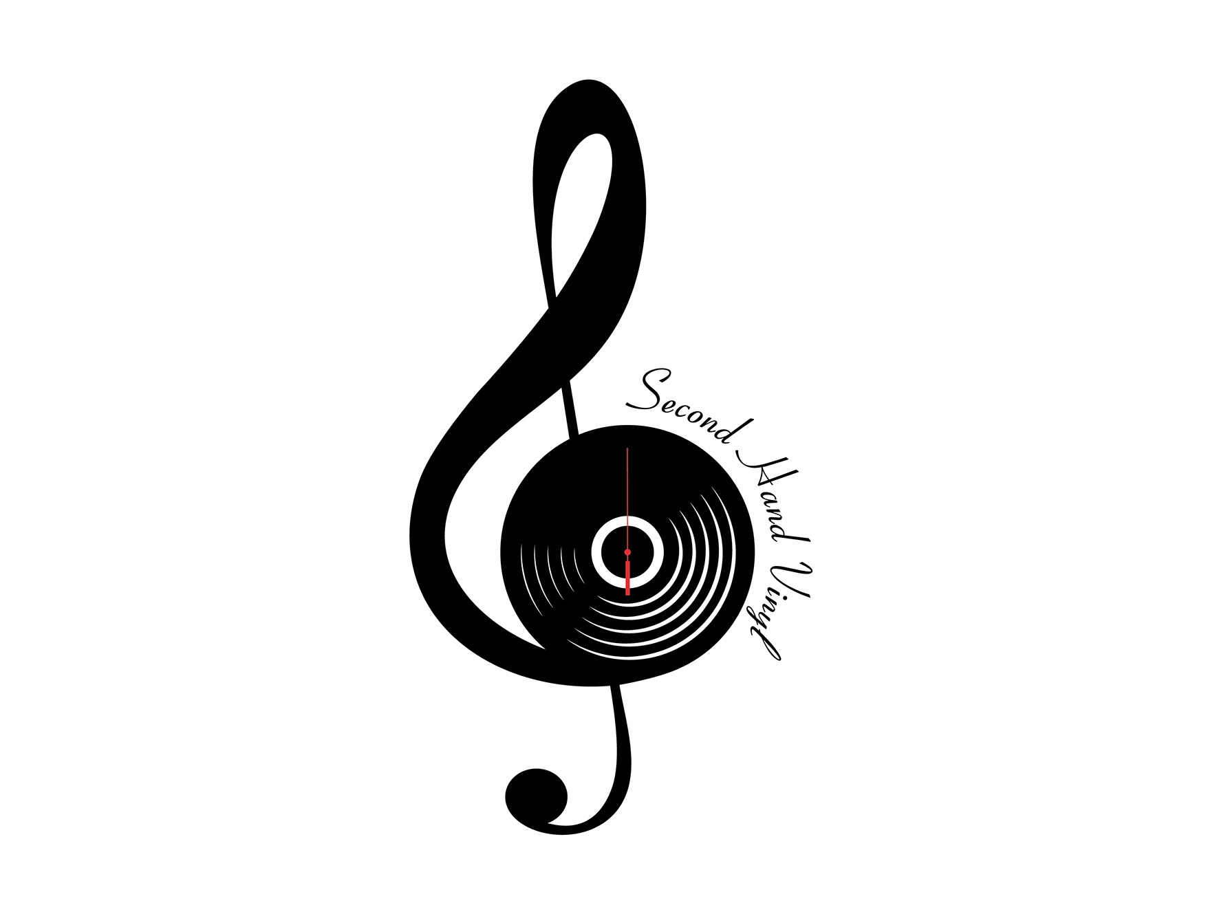
The logo for Second Hand Vinyl has been designed to reflect the identity of an online shop dedicated to selling pre-owned vinyl records.
The central concept combines a treble clef with a vinyl record, merging musical notation with the physical format of sound storage.
The vinyl record is further integrated with the second hand of a clock, transforming the record into a clock face. This introduces the theme of time, suggesting the continuous journey of music across generations and how older records are given new life through resale and rediscovery.
The use of the second hand also directly references the name “Second Hand Vinyl,” reinforcing the idea of second-hand goods—vinyl records that have had a previous life and are now being shared again through an online marketplace. This connection strengthens the brand identity and makes the concept immediately understandable.
Overall, the logo combines musical symbolism, time imagery, and conceptual meaning to create a modern and memorable identity that reflects the essence of a second-hand vinyl online shop, bridging past and present through music.